
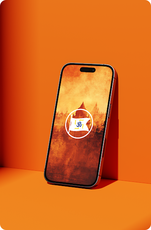
OM Sanatani is a multi-role mobile application designed for the SDSS Trust to unify Sanatani communities. The platform allows users to participate in events, contribute to causes, publish content, and receive spiritual guidance through a digital-first approach.
Client Requirement
The client wanted a role-based, location-aware app that would connect volunteers, organizers, and publishers while preserving spiritual tone and ritual sensitivity. The experience needed to support quick action (signing up, volunteering, donating) and deeper engagement (spiritual content, guided practices), while keeping navigation intuitive for users across ages and tech comfort levels. It was essential to reduce cognitive load, surface contextual opportunities (nearby events, volunteer needs), and make content publishing trustworthy and discoverable without overwhelming community members.
Our Solution
We designed a multi-layered experience architecture that balanced transactional community actions with contemplative spiritual experiences. The interaction design prioritized large tappable targets, simple information architecture, and culturally appropriate visual cues so users could quickly complete tasks and return to spiritual practice. Navigation and content hierarchy were refined to keep immediate actions prominent while making deeper content discoverable through personas, user journeys, and iterative usability testing.
Industry
Event Management / Spiritual Platform
Services
UI/UX Design
Timeline
2023 – 2024
Brandmark Creation
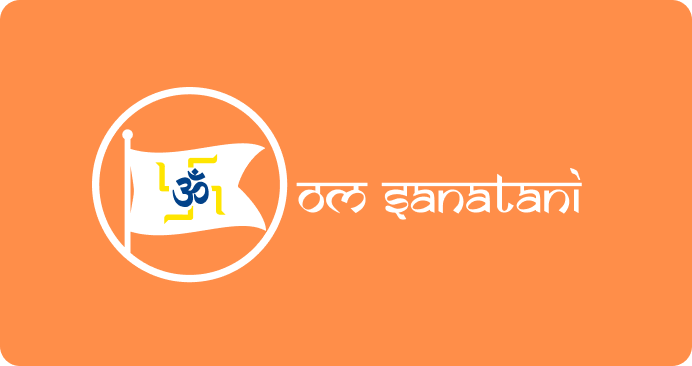
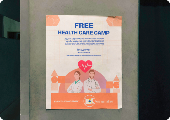
The OM Sanatani logo captures the essence of community, divinity, and tradition in a modern mark. Centered around a saffron flag bearing the sacred Om symbol, the logo reflects both movement and reverence. The flexible identity system adapts seamlessly across digital interfaces, app icons, and printed materials — tying together a unified brand presence that feels both devotional and digitally forward.


Visual Identity
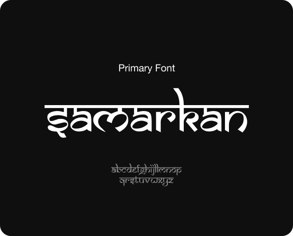
The OM Sanatani design system blends tradition with modern UI sensibilities. Using vibrant hues like pumpkin orange, deep blue, and sacred yellow, the palette evokes spiritual warmth while ensuring accessibility and contrast. The primary font, Samarkan, brings in cultural depth with its Devnagari-inspired curves, while the secondary font, Poppins, maintains legibility and balance throughout the app. This system ensures a consistent visual language across roles, screens, and spiritual touchpoints.


User Interface Highlights
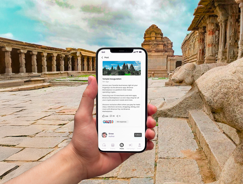
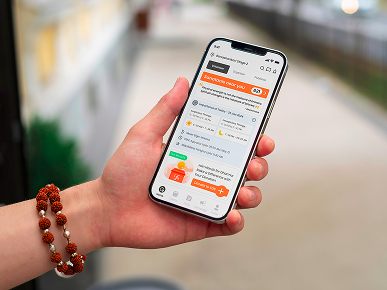
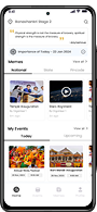
Role Dashboards – Personalized dashboards for volunteers, organizers, and publishers that use progressive disclosure to surface the most relevant tasks and metrics per role, enabling fast triage and follow-up.
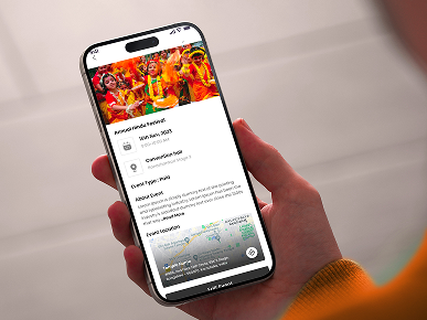
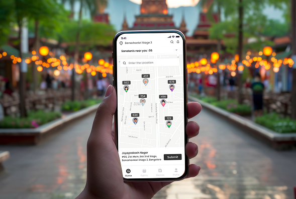
Event & Volunteering Flows – Intent-driven sign-up and check-in flows that combine geolocation-aware discovery, stepwise onboarding, and micro-interactions to confirm commitments and reduce no-shows.
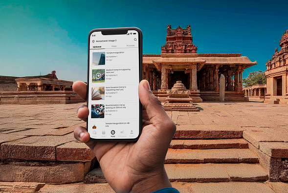
Publishing & Moderation Module – A content workflow that supports drafts, scheduled publishing, and contextual moderation; content is categorized with clear IA so teachings, announcements, and stories are discoverable.
Daily Spiritual Layer – Context-aware prompts (daily readings, short rituals, localized recommendations) combined with gentle gamified cues that encourage repeat engagement and habit formation.
Final Output
The product now functions as an accessible community hub where participation, publishing, and spiritual practice coexist. Users can discover events, commit to volunteering, and engage with curated spiritual content with minimal friction. Contextual nudges, clear affordances, and role-specific flows increased participation clarity and repeat engagement, strengthening community coordination and spiritual connection.
Ready to discuss your project with us?
Get the creativity and uniqueness that only human brains can deliver, with the speed and efficiency of AI tools. Let’s create something that stands out.